Reading a line chart
What is a line chart?
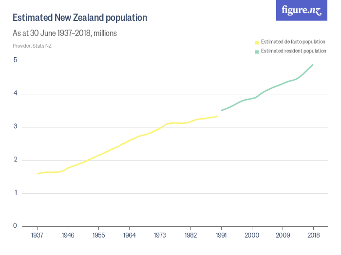
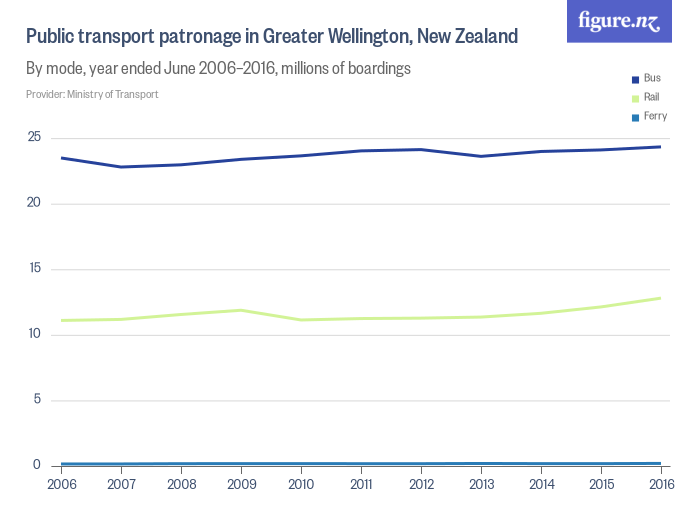
Line charts are one of the most commonly used chart types. A line chart is most often used to show how something changes over time, like the population of New Zealand. You may have heard this type of data or chart called a ‘time series’.
For this type of chart, the x-axis (that’s the horizontal one) will show time. It could be seconds, days, months, years, or even something like days since a certain event/threshold.
The y-axis (the vertical one) shows the thing you are measuring, like the number of people in New Zealand. Measures can be things like counts, rates, proportions, and more.
Read our article about the different types of measures.
Understanding a line chart
Before getting into specifics about line charts, we recommend you read our article on the basics of chart reading.
Once you’ve done that, we’re ready to look at some specifics of reading line charts.
The basics
Because line charts are all about how something changes over time, when we’re looking at a line chart, we tend to care less about an individual data point and more about the relationship between points.
When a value is higher than the previous value, the line slants upwards. When it’s smaller, it slants downwards. And when it’s the same, it’s flat.
This means we can understand the relationships between points by looking at two things: the shape of the line and the trend.
Look at the shape
The shape is what it sounds like: the physical appearance of the line.
Is it spiky, going up and down in a seemingly unpredictable fashion? Lines that are spiky suggest the measurement is affected by a range of different factors that can be hard to predict.
Is it seasonal, with regular peaks and troughs in a pattern repeated over the time period? Lines that have regular peaks and troughs suggest that there is one or more factors that have a strong regualr impact on the measurement, like time of year.
Is it mostly consistent, with points that all seem to increase or decrease?
Is it flat, with little change in either direction?
Is it curving upwards, increasing by a larger amount each time? Lines that curve upwards indicate rapid growth, suggesting that one or more factors may have changed and are having a strong impact.
Look at the trend
The trend tells us, overall, whether the values are increasing or decreasing or staying the same. You can have a line chart that is really spiky in shape with lots of increases and decreases, but that overall trends upwards over time.
What next?
Now that you know how to read a line chart, you’re ready to use the 5 questions to understand the chart.