Basics of reading a chart
When you first look at a chart, it’s easy to miss important details that help you understand what the chart’s data says. Follow these steps to help ensure you don’t miss important bits.
Once you understand what the chart’s data shows, you can then use Figure.NZ’s 5 questions to help contextualise and understand the data.
Read the words on the chart
Read the title, the axis labels, and the legends. Check any definitions for words you don’t know. You may find these in the metadata, or you might need to look up the source information. Read who collected the data, and how they collected it. Are they a trustworthy source?
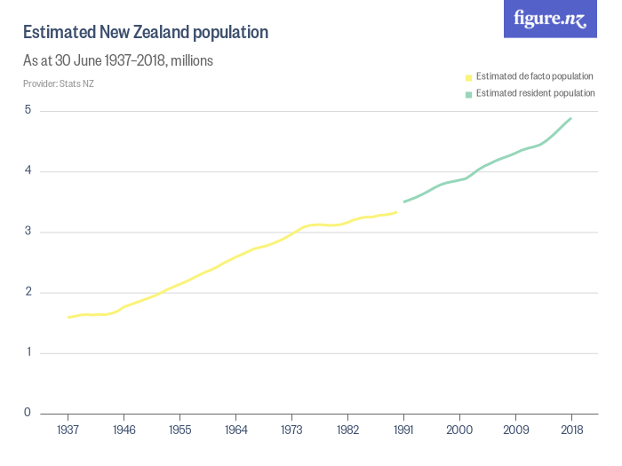
In this example, notice that the data is from Stats NZ, who are a trustworthy source. The measurement changes from de facto population (total people in the country) to resident population (total people who normally live in the country).
Check the axis scales
Check how each axis is scaled. Is it a simple number, or is it thousands or millions. Check if the axis scale is consistently spaced (linear), or if it uses a different scale like log scale. In the line chart above, the scale is in millions.
A log scale is a way of showing numbers that are over a very wide range on a single chart. It’s often used for exponential growth to help us assess whether the rate of growth is increasing or decreasing.
This can also help identify charts where someone is trying to mislead you by using an inconsistent scale.
Check the axis start point
Generally, you expect a linear scale chart to start the y-axis (vertical axis) at 0. If a chart doesn’t start at 0, it can be a warning sign. However, not all charts that start at a number other than 0 are misleading. Sometimes, when you’re looking at a timeseries with small but significant changes to a large number, starting at 0 would hide these changes. In this instance, it can be helpful to start at a larger number, but the axis should be clearly labelled to show this.
Read the metadata
It sounds boring, but metadata has really important information like who collected the data, when it was collected, how it was collected, and sometimes even why it was collected.
It may tell you limitations of the data, or alert you to issues in data quality.
It may have definitions for terms you find on the chart. Reading the metadata gives you secret superpowers for understanding a chart.