Different ways data is measured
There are lots of different ways to measure data. When you’re looking at a chart or a map or dataset, understanding the type of measurement you’re looking at helps you to understand what’s going on.
Some of these measures are also calculations. This means that the data is counted or measured and then transformed to help you understand it.
Types of measures
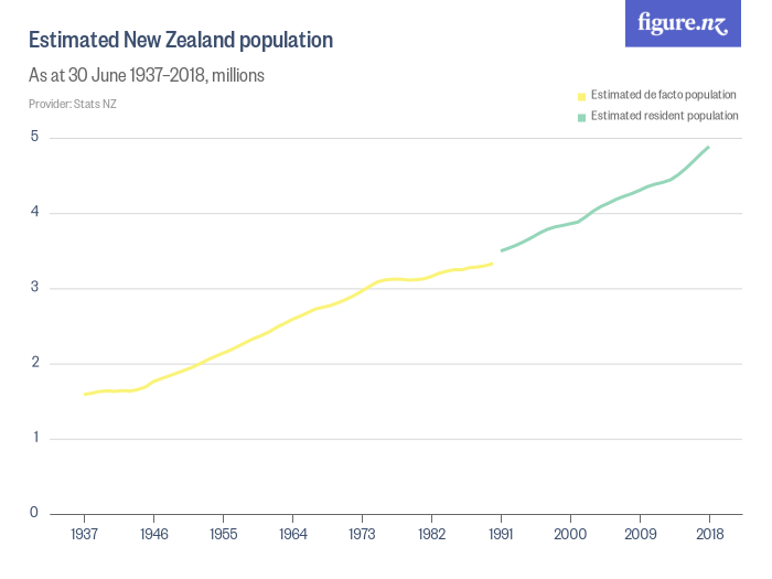
Counts
This is how many of a thing there are, like people, or dogs, or cars imported.
A bar or column chart using counts shows you how the total number of things in two or more categories compare to each other, or to themselves over a non-continuous time period.
A line chart using counts shows you whether the number of something is increasing or decreasing over time.
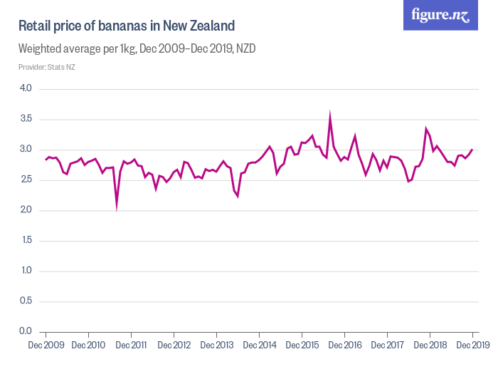
Measurements
These are measurements of something, like height, weight, volume, temperature, speed.
A bar or column chart using measures might show you how a single measure, like maximum windspeed, compares across two or more variables. A line chart using measures shows you how the attribute you are measuring changes over time, like charting your height each month.
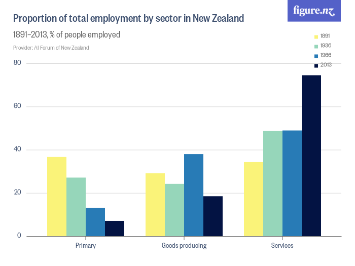
Proportions or Percentages
A propotion or percentage tells you how much something is compared to the total amount, like the proportion of women who are CEOs.
A bar or column chart using percentages helps us visualise how two or more variables compare to each other as a proportion of the whole amount.
A line chart using proportions or percentages helps us understand whether an increase or decrease over time in our count or measure changes the relationship that has to the total number. If we look at our CEO example, if 5 new women are hired as CEOs, and no new men are hired, our proportion of women CEOs increases. But if lots of men were hired too, our proportion may not increase.
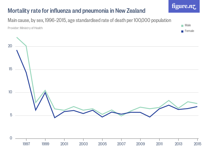
Rates
A rate is a measure of how often something happens, also called ‘frequency’. A rate can either be:
- The frequency that something happens over a specific interval of time. For example a rate of 30 km per hour.
- The frequency that something happens in a particular group or population. For example, the rate of breast cancer in New Zealand is 1 in 2,118 for women and people with breasts in their 20s.
Statistics like population mortality rates are usually shared as a rate per 1000 people. Be careful when you see or use a rate. It’s important to check what the constant (the ‘per 1000’ bit) is, as different statistics use different measures, like per 100, per 1000, per 100,000. Or even per 2,118, in the case of the breast cancer statistic!
Similar to proportions or percentages, using a rate on a column or bar chart helps us visualise how two or more variables compare to each other. Like proportions or percentages, using a rate on a line chart is a way of telling us whether something is increasing or decreasing compared to the population as a whole.
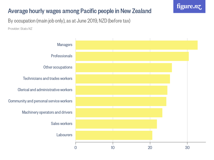
Averages and Medians
Averages (also called means) and medians are ways to look at counts or measurements of a large number of things. They’re both used when we’re trying to get a feel for the most common experience of a group.
Averages look at the most common experience, and medians look at the experience of the person in the middle of the group.
On a line chart, averages or means show us how that common experience is changing over time.
On a column chart, they’re often used to compare two or more different groups.